Load background images based on the screen size
Load small background images on smaller screens and large ones on larger screens.
Last Updated : May 27, 2020

Load background images based on the screen size
Load small background images on smaller screens and large ones on larger screens.
Last Updated : May 27, 2020
TLDR : If all that you are interested in is code to make this work, go to this section and grab the code snippet.
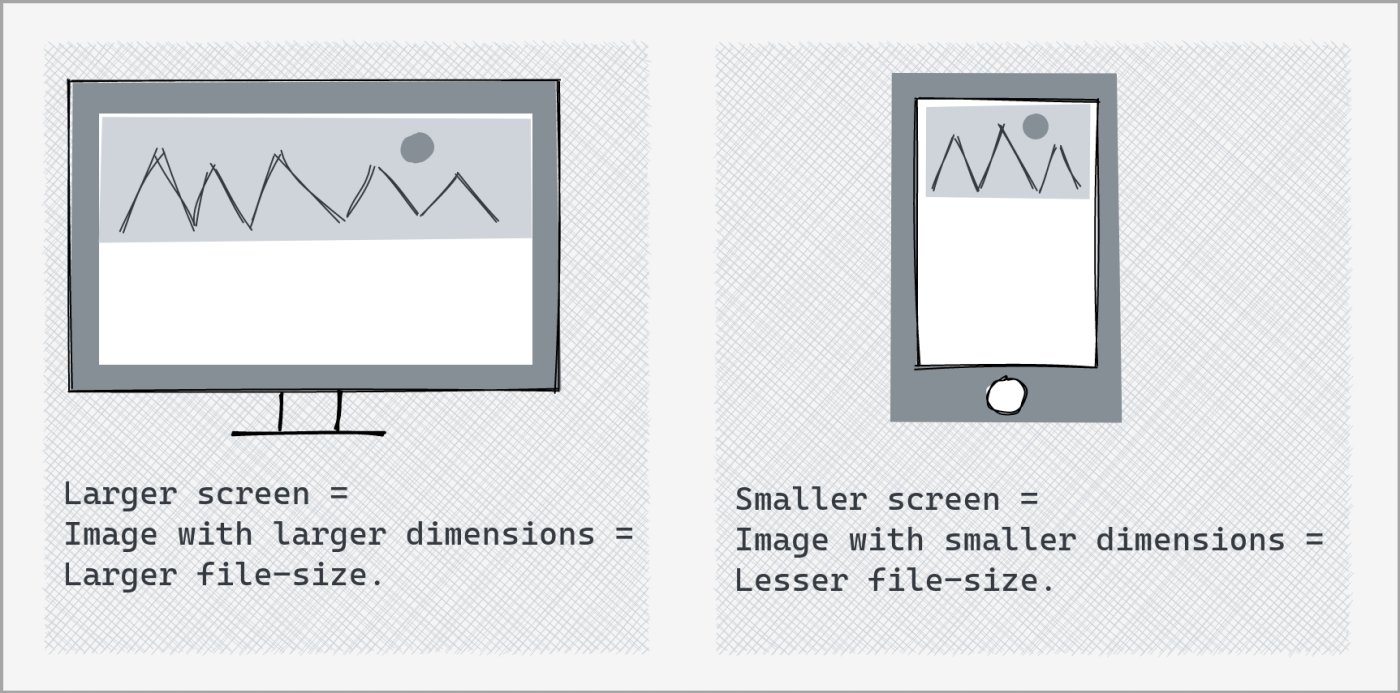
Responsive Background Display isn't Responsive Background Loading
Setting a background's 'background-size' property to 'cover' allows us to ensure it covers the background region fully on any screen size. But, since the same image is loaded irrespective of the screen-size, this setting is responsive only in terms of image display and not in terms of the image loaded. As a result, you could have a 1400px background image loaded on a Google Nexus 4 mobile screen.
<!--Same image is loaded as page background irrespective of device screen size -->
html {
  background: url('large_bg.jpg') no-repeat center center fixed;
  background-size: cover;
  -webkit-background-size: cover;
  -o-background-size: cover;
  -moz-background-size: cover;
}
Responsive Background Image Loading
Using media queries allows us to specify different background images for different screen sizes purely using CSS. This way, background image sized according to screen size gets downloaded by the browser.
<!--Using media queries to select right sized background image to download-->
@media screen and (max-width: 480px) {
  html {
    background: url('small_bg.jpg') no-repeat center center fixed;
  }
}
@media screen and (min-width: 481px) and (max-width: 900px) {
  html {
    background: url('med_bg.jpg') no-repeat center center fixed;
  }
}
@media screen and (min-width: 901px) {
  html {
    background: url('large_bg.jpg') no-repeat center center fixed;
  }
}
html {
  background-size: cover;
  -webkit-background-size: cover;
  -o-background-size: cover;
  -moz-background-size: cover;
}
In case if you want to ensure that background image for an element that is hidden on a certain screen isn't downloaded, just use CSS media queries to set background to 'none' for that screen-size.
<!--Avoid downloading background on smaller screen-->
@media screen and (max-width: 480px) {
  html {
    background: none;
  }
}
If you want to make sure you do not load hidden the images (loaded via <img> tag), check out this how-to.

Also Read