Defer Offscreen Images
Delay loading images that appear below-the-fold for faster rendering of above-the-fold page content.
Last Updated : April 21, 2021

Defer Offscreen Images
Delay loading images that appear below-the-fold for faster rendering of above-the-fold page content.
Last Updated : April 21, 2021
What it means?
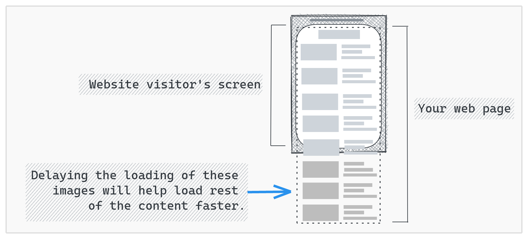
Deferring off screen images means delaying loading of images that appear below-the-fold on the page. This ensures that above-the-fold content on the page renders faster. This how-to details how we can defer off-screen images in various situations:
Defer off-screen images on a regular website
If you have a complete control over the page's HTML code, you can use one of the two approaches detailed below to lazy-load the images:
With Native Lazy Loading (no JavaScript)
With native lazy loading, images loading can be deferred without any JavaScript. This makes the implementation very simple. The downside of this approach (as of April, 2021) is that this won't defer loading of images on the Safari browser. To achieve native image lazy loading, add the attribute loading="lazy" to the img tag:
<!--Use loading="lazy" attribute for images that are to be loaded lazily -->
<img src="image.jpg" loading="lazy" />
With JavaScript
If you are looking for a lazy-loading solution that has a wider cross-browser support, you can use a lightweight JavaScript library to achieve this.
1. Download the lazysizes Javascript library from here. Once downloaded, include it in your page through the following script tag:
<script src="lazysizes.min.js" async=""></script>
2. Within your HTML <img> tags:
<!--Use data-src. And, specify lazyload class -->
<img data-src="image.jpg" class="lazyload" />
The above change will ensure that the loading of image.jpg is deferred in case if it is offscreen else it will be loaded immediately. So, the above change shall be applied to all the images on the page. Read on here if you want to use this library with responsive images or WebP images or both.
Note: To ensure that the deferred off-screen images are SEO friendly, check-out this how-to.
Defer off-screen images on a Wordpress website:
If you seek defer loading of off-screen images on your wordpress website, a3 Lazy Load is the Wordpress Plugin of our choice. The plugin allows you to setup lazy loading within a few clicks with SEO friendly no-script tags, custom loaders, capability to lazy load videos, feature to exclude specific images, etc. The plugin has 100k+ installations with a rating of 4.4
Defer offscreen images on a Magento site:
If you seek to setup deferred loading of offscreen images for your Magento site, we recommend WeltPixel's lazy loading extension. Once installed and enabled from Magento admin, this extension works out of the box with Magente 2 product pages, search pages and listing pages. The extension is SEO friendly and can be used with custom images within the store as well.
Defer offscreen images on Shopify Site:
To defer loading of offscreen images in your Shopify site, you will have to modify your Theme (theme.liquid file) to leverage the lazySizes library. Here's how:
1. Download the lazysizes Javascript library from here and upload it to your theme's /assets folder.
2. Add the following lines to your theme.liquid just before the </head> tag:
<script src="{{ 'lazysizes.min.js' | asset_url }}" async="async"></script>
3. Change the image tags in your theme by adding class "lazyload" to the image tags and changing the src attribute to data-src attribute:
{% for img in product.images %}
 {% assign img_url = img | img_url: '1x1' | replace: '_1x1.', '_{width}x.' %}
 <img class="lazyload"
 src="{{ img | img_url: '300x' }}"
 data-src="{{ img_url }}"
 data-widths="[720, 1080]"
 data-aspectratio="{{ img.aspect_ratio }}"
 data-sizes="auto">
{% endfor %}
Defer offscreen images on a React website:
There are two ways to defer images for a React based website. An easier implementation can be achieved by using an npm package. But, this would add a few KBs to your React bundle size. Avoiding this would require creating your own implementation to lazy-load images.
With an npm package
react-lazy-load-image-component is our recommended package (npm, github). At 5 kB gzipped & minified, this is a lightweight solution to achieve the desired lazy loading. It provides you with a LazyLoadImage component that you can used instead of the regular image component. This ensures that the image file is downloaded only when the component is in the user's viewport:
import { LazyLoadImage } from 'react-lazy-load-image-component'
.
.
.
const MyComponent = () => {
  ....
  ....
  return (
   <LazyLoadImage
          alt="provide your alt text here"
          height="specify image height"
          src="specify img src path here"
          width="specify image width" />
  );
}
The component also comes with a bunch of other options to execute code before or after rendering component, have a placeholder element for the image, provide a blur-effect when loading the image, etc.
Without an external package
We can leverage the browser's IntersectionObserver to create an image lazy-loading solution of our own. Below is a light-weight implementation to lazy-load images.
1. Define the image lazy-loading function in a file (like util.js)
export const lazyImage = function () {
   if ("IntersectionObserver" in window) {
   const observer = new IntersectionObserver((entries) => {
      entries.forEach((entry) => {
        if (entry.intersectionRatio > 0) {
          if (entry.target.hasAttribute("data-src")) {
            entry.target.setAttribute(
              "src",
              entry.target.getAttribute("data-src")
            );
            observer.unobserve(entry.target);
          }
        }
      });
    });
    document.querySelectorAll(".lazy-image").forEach((gameImg) => {
      if (gameImg.getAttribute("is-observed") != "true" && gameImg.getAttribute("data-src") != null)
      {
        gameImg.setAttribute("is-observed", "true")
        observer.observe(gameImg);
      }
    });
  } else {
    var imgList = document.querySelectorAll(".lazy-image");
    Array.prototype.forEach.call(imgList, function (image) {
      image.setAttribute("src", image.getAttribute("data-src"));
    });
  }
};
2. To lazy-load images within any component:
src to the image URL, set the data-src to the image URL.src to a blank inline image.lazy-image to the img tag's className.import React, { useEffect } from "react";
import { lazyImage } from "common/util";
export const MyComponent=(props)=>{
useEffect(() => {
lazyImage();
});
return (
<div className="container">
<img data-src="specify-img-src-path-here"
className="lazy-image"
src="data:image/png;base64,iVBORw0KGgoAAAANSUhEUgAAAAEAAAABCAQAAAC1HAwCAAAAC0lEQVR42mNkYAAAAAYAAjCB0C8AAAAASUVORK5CYII=" />
</div>
);
}

Also Read

