SEO Friendly Lazy Loading of Images
How to lazy load images for faster load times with no negative SEO impact.
Last Updated : July 1, 2020

SEO Friendly Lazy Loading of Images
How to lazy load images for faster load times with no negative SEO impact.
Last Updated : July 1, 2020
Update : As of June-2020, Google Chrome (v76 onwards) and Firefox (v75 onwards) support native lazy-loading (read here). But, since it will not lazy-load the images on Safari browser (yet), we continue to recommend the below approach to lazy loading.
TLDR : Just go to bottom and grab the code snippet.
Lazy Loading With lazySizes JS
lazySizes is one of the most feature rich yet lightweight lazy loading library out there on the internet. Written in VanillaJS, it is 3.7 KB gzipped and 6.6 KB in size. It's support for picture element allows you to use it with webp images. It also allows specifying responsive sizes. It leverages Intersection Observer (if browser supports) out of the box. This means images are loaded as the user scrolls down. You can even use it with iframes to lazy load Youtube videos.
Basic Lazy Loading
Getting lazy loading to work with lazySizes is simple - just include the JS library on your page as below:
<!--Include the lazysizes js -->
<script src="lazysizes.min.js"></script>
And, add 'lazyload' class to your images and add data-src attributes to point to the images that lazySizes should lazy load:
<!--Use data-src and specify lazyload class for images -->
<img data-src='large.jpg' class="lazyload"
  alt="Your Alt Text Here" title="Your Title Text Here" />
Lazy Loading Responsive Images
If you want to lazy load images based on the size of device screen, use the data-srcset attribute exactly the way you would you srcset attribute:
<!--Use data-src and specify lazyload class for images -->
<img data-src="large.jpg"
    data-srcset="small.jpg 480w,
    		medium.jpg 900w,
    		large.jpg 1400w"
    		class="lazyload"
        alt="Your Alt Text Here" title="Your Title Text Here" />
Lazy Loading Modern Image Formats (like WebP)
lazySizes works with picture elements as well. This means, you can use it to lazyLoad modern image formats like WebP for browsers that support it with a fallback to JPG/ PNG. Here's how:
<!--Use data-srcset, data-src and specify lazyload class for images -->
<picture>
  <source data-srcset='small.webp' type="image/webp" media="(max-width: 500px)">
  <source data-srcset='medium.webp' type="image/webp" media="(max-width: 900px)">
  <source data-srcset='large.webp' type="image/webp" media="(min-width: 901px)">
  <source data-srcset='small.jpg' type="image/jpg" media="(max-width: 500px)">
  <source data-srcset='medium.jpg' type="image/jpg" media="(max-width: 900px)">
  <source data-srcset='large.jpg' type="image/jpg" media="(min-width: 901px)">
  <img data-src="large.jpg" class="lazyload"
    alt="Your Alt Text Here" title="Your Title Text Here" />
</picture>
The above code snippet shall lazy load responsive images in the right image format that client browser supports. Note that, in switching from `` to `
SEO Friendly Image Loading with noscript
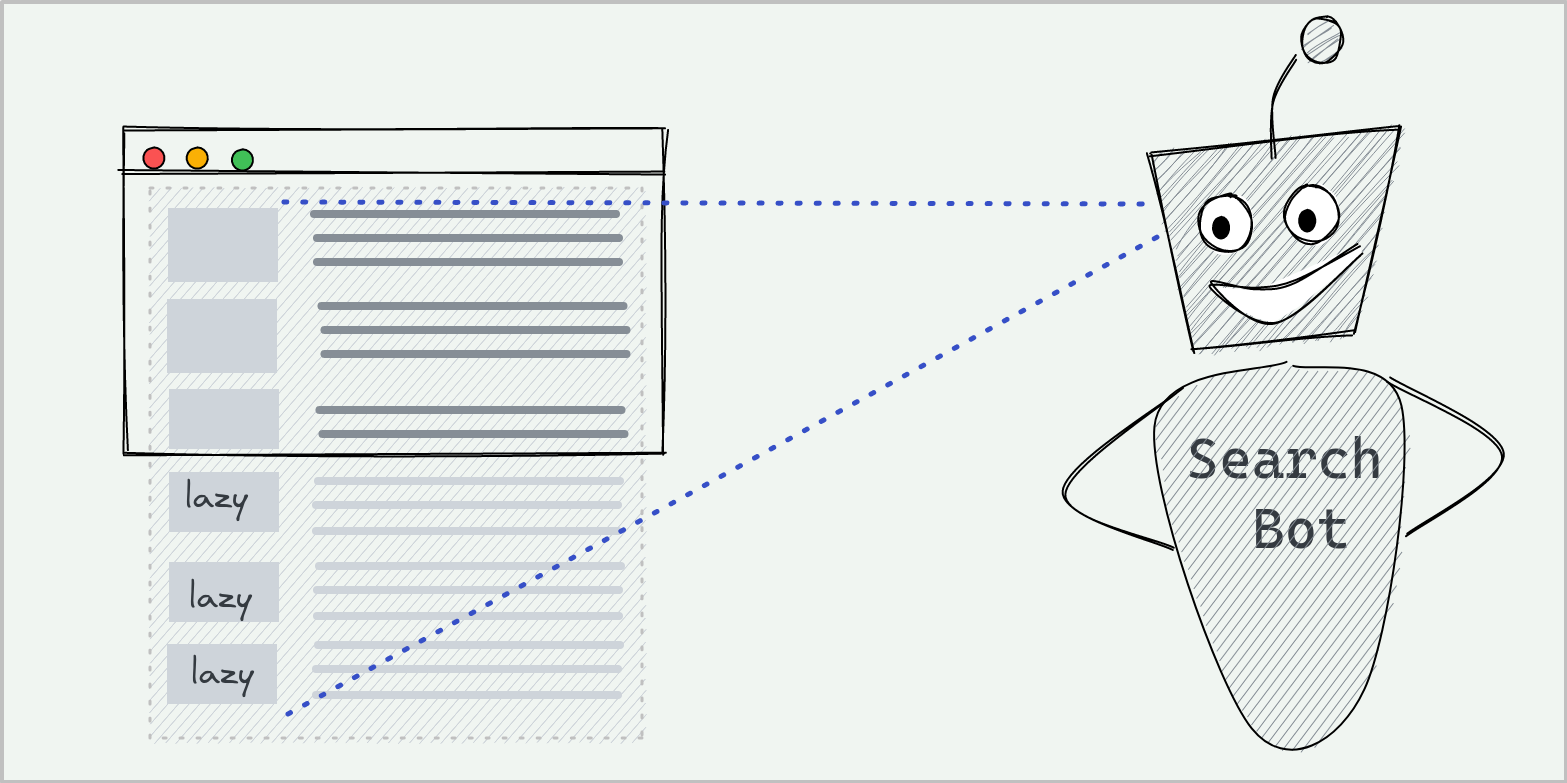
Like any lazy loading solution, lazySizes is JavaScript driven. This means we need to combine it with some noscript magic to ensure these images are indexed by search engine bots even if they cannot execute JavaScript.
<!--image lazy loading-->
<img class="lazyload" data-src="lazyLoadImage.jpg"
    alt="Your Alt Text Here" title="Your Title Text Here" >
<!--noscript for non-javascript rqeuests -->
<noscript><img src="lazyLoadImage.jpg" alt="Your Alt Text Here"
	title="Your Title Text Here" />
</noscript>
Combining It All
Combining the details listed above can yield an image loading solution that is fast, SEO friendly and browser compatible.
Grab lazysizes JavaScript file and use it as detailed below:
<!--Include the lazysizes js -->
<script src="lazysizes.min.js"></script>
<!--Use data-srcset, data-src and specify lazyload class for images -->
<picture>
<source data-srcset='small.webp' type="image/webp" media="(max-width: 500px)">
<source data-srcset='medium.webp' type="image/webp" media="(max-width: 900px)">
<source data-srcset='large.webp' type="image/webp" media="(min-width: 901px)">
<source data-srcset='small.jpg' type="image/jpg" media="(max-width: 500px)">
<source data-srcset='medium.jpg' type="image/jpg" media="(max-width: 900px)">
<source data-srcset='large.jpg' type="image/jpg" media="(min-width: 901px)">
<img data-src="large.jpg" class="lazyload"
alt="Your Alt Text Here" title="Your Title Text Here" />
</picture>
<!--Use noscript to make sure images are indexed -->
<noscript>
<img src="large.jpg" alt="Your Alt Text Here" title="Your Title Text Here" />
</noscript>
Also Read