Avoid Large Layout Shifts Resulting from Loading Images
Check if loading images are causing large cumulative layout shifts on your page & fix it.
Last Updated : July 15, 2020

Avoid Large Layout Shifts Resulting from Loading Images
Check if loading images are causing large cumulative layout shifts on your page & fix it.
Last Updated : July 15, 2020
What it means?
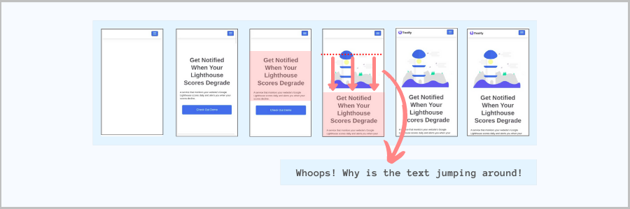
When your page is loading, a lot of content may shift around as parts of the page become visible. This is called layout shift & is considered harmful for your visitors' experience.
The best way to see it in action for your webpage is to see how your page loads visually on a slow network. To do so, just test your URL on www.webpagetest.org with a connection of '3G' or '3G Slow' and with 'Capture Video' option enabled. Then look for test results loading snapshot images or video.
Identify what is causing the layout shift
You can identify what is causing your content to shift from your URL's PageSpeed report:
If the element causing layout shift is an image (which is commonly the cause), read further to address it.
Fix layout shifts from images
When image dimensions are fixed & known
If the image dimensions are fixed & known, provide them via the height and width attribute to avoid layout shifts:
<img src="url" width="nn" height="mm" />
When image dimensions are unknown but it's aspect ratio is fixed
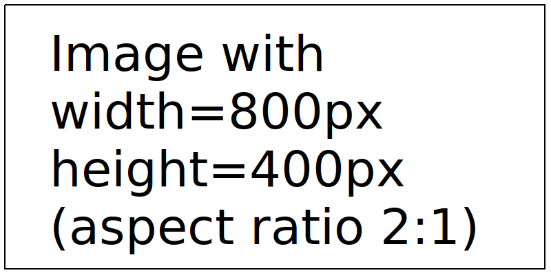
If the ratio of width to the height for the image is known, we can still avoid layout shifts. Let's presume our image's aspect ratio is 2:1 (width is twice the height). This means it's height is 50% that of it's width. Now, we can create a container `div` with 50% padding to avoid layout shift as in below code-snippet:
<div style="width:100%;height:0; padding-top:50%;position:relative;">
  <img  src="<imgUrl>" style="position:absolute; top:0; left:0; width:100%;">
</div>
Change the number for `padding-top:50%;` in the above snippet based on your image's aspect ratio.
When image dimensions and aspect ratio are not known
If image dimensions and aspect ratio cannot be added to the page's HTML, we have to take the nearest guess at the aspect ratio & then leverage CSS property `object-fit: contain` for the best feasible solution with no layout shift. Details below:
<div style="width:100%;height:0; padding-top:50%;position:relative;">
    <img src="url" style="position:absolute; top:0; left:0; object-fit: contain;object-position:50% 0;width:100%;height:100%;" />
</div>
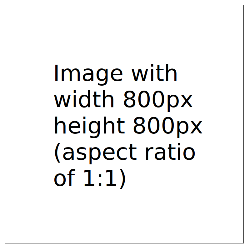
Below are some examples of images of different dimensions & aspect ratio within container with the same CSS. The container's background-color has been set to visualilze how the code handles different images.
<div style="width:100%;height:0; padding-top:50%;position:relative;background-color: #2a92ed;">
  <img src="https://cdn.tezify.com/images/cls_800_x_400.png" style="position:absolute; top:0; left:0; object-fit: contain;object-position:50% 0;width:100%;height:100%;" />
</div>
<div style="width:100%;height:0; padding-top:50%;position:relative;background-color: #2a92ed;">
  <img src="https://cdn.tezify.com/images/cls_800_x_600.png" style="position:absolute; top:0; left:0; object-fit: contain;object-position:50% 0;width:100%;height:100%;" />
</div>
<div style="width:100%;height:0; padding-top:50%;position:relative;background-color: #2a92ed;">
  <img src="https://cdn.tezify.com/images/cls_800_x_800.png" style="position:absolute; top:0; left:0; object-fit: contain;object-position:50% 0;width:100%;height:100%;" />
</div>