Averages in Web Analytics : They hide more than they reveal
And, what can you do about it.
Jan 1, 2018

Averages in Web Analytics : They hide more than they reveal
And, what can you do about it.
Jan 1, 2018
Note: Average in this post refers to Arithmetic mean.
Averages are every where. Average temperature, average speed, average growth rate and what not. And it makes sense. Almost everyone understands it, it is easy to calculate and you get a single number to put across your point. Fast and simple.
However, the problem with it's wide-spread use is that we often end up using it in places that demand further scrutiny. And in process, we miss valuable insights.
Average Summarizes Data
"A man may have six meals one day and none the next, making an average of three meals per day, but that is not a good way to live." - Louis Brandeis
Let's say you optimized your Site's Homepage last month to make sure it load up fast. Ever since, you have been keenly watching the Average Page Load time for your homepage in your weekly reports. Week after week, the figure stays close to 3 seconds. Makes you smile every time. Somehow, six months later, you land up on the below graph by chance:
Perplexed, you look at the graphs for other weeks. Week after week, you observe the same pattern of notable slow down over the weekends. The reason average didn't communicate the issue in this case is that spikes of 2 days averaged out in a 7 day report. Understandably so. Because average is a measure of central tendency. It is supposed to provide one value that represents the entire set. All of 7 days.
Average is Sensitive to Extreme Values:
Let's look at another problem with average through a different example. Let's say you have been working hard to improve the Average Revenue Per User (ARPU) for your product. To do so, you have been focussing on upsells and premium plans. After all these efforts, last month's data suggests a 5% fall in ARPU. This leaves you frustrated. How can you explain that? Are your efforts having a negative revenue impact? You decide to give your data a closer look with the following graph:
The above distribution clearly shows that you were able to move Subscribers from the Beginner plan to plans higher-up. This means that your ARPU improvement efforts are definitely showing results. Turns out, the single Enterprise subscriber that you lost last month was 5x the size of any other subscriber. The effect of losing that single subscriber had a greater impact on your ARPU than the gain from other (over dozen) subscribers. The reason average (ARPU) didn't communicate the improvement in this case is that it gets heavily impacted by extreme values.
Solution
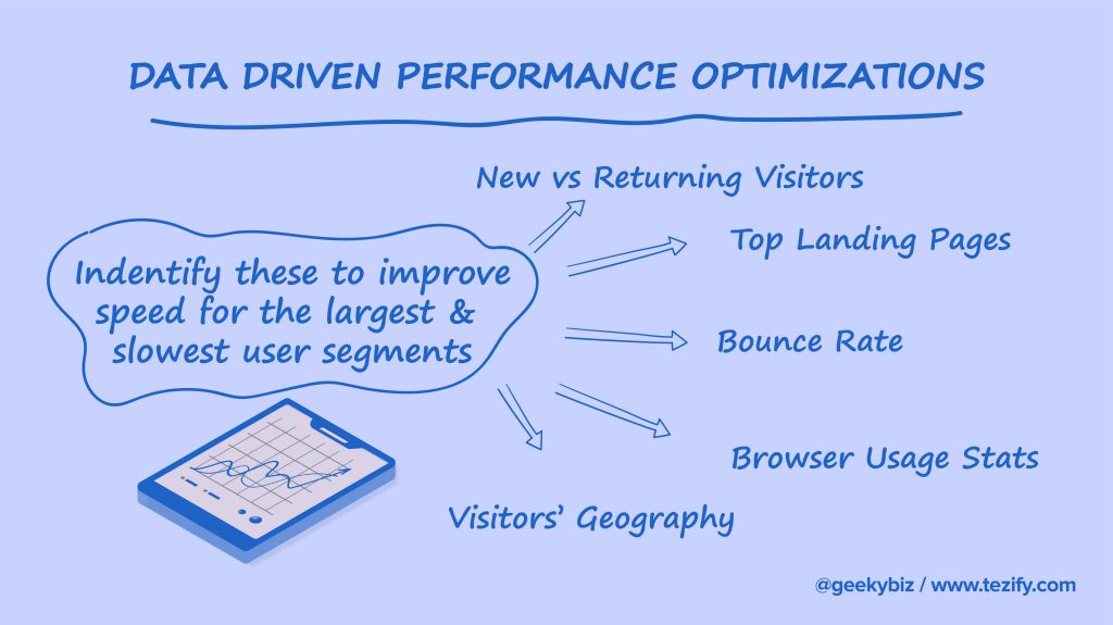
We are often inclined to use Average because of the volume of data we are required to deal with. For example : Looking for site speed issues, how can we look through Page Loading time for the entire month's page visits? Hundred thousands of them. Averaging every day's numbers leaves us with 30 values - that is something manageable. But, like we saw in this post, Average causes us to miss valuable insights.
The way out is to use percentiles. We can use median (50 percentile) or 90 percentile or 99 percentile - depending on the subject we are dealing with. If we somehow want to use averages, we should first look at the Trend and Distribution. Through charts. We cannot look through Page Loading time for entire month's visits. But we can look at it's trend chart. Or, a histogram showing distribution of visits by Page loading time.
Averages are more appropriate for reports to quickly put across your point. But only after analyzing the underlying data and making sure that average speaks what the underlying data has to tell.

Also Read